Get started
A developer's guide to consuming Tellus tokens — the model, the per-platform names, exporting the files, and adding new tokens.
Tokens are the single source of truth for color, type, spacing, radius, stroke, and elevation. You never hand-author these values in product code — you reference the generated token and let it resolve. This page covers everything you need to wire the system into iOS, Android, or a Figma file, and how new tokens get added.
The token model
There are two tiers, and the rule between them is the whole game:
1 · Primitives
The raw palette & scale
Every color step (color.brand.500) and numeric value (scale.4). They have literal values — but you never reference them directly in a component.
2 · Semantics
Intent, aliased to a primitive
What a value means in context (color.background.action.primary.default). It doesn’t hold a value — it points at a primitive (→ {color.brand.500}).
Components consume semantics. Always. A button reads color.background.action.primary.default — not color.brand.500, and never #4B56C7. The semantic layer is what lets a single rebrand, a dark theme, or a platform tweak flow through the whole app without touching a component.
Use the token, not the value
This is the one mistake that quietly breaks the system. When you inspect a layer in Figma, the dev panel resolves a semantic token down to a literal — you’ll see something like background → #4B56C7. That hex is the answer to “what color is it right now,” not the thing you should paste.
Copy the token reference — never the resolved hex
#4B56C7 because that’s what color.background.action.primary.defaulthappens to resolve to today, in this theme. Paste the hex and you’ve hardcoded a dead value: it won’t flip in dark mode, won’t follow a rebrand, and won’t differ per platform. Reference the generated token symbol instead — it stays bound to the pipeline.Same token color.background.action.primary.default, the right way and the wrong way on each platform:
| Platform | ✗ Hardcoded value | ✓ Token reference |
|---|---|---|
| iOS · Swift | UIColor(red: 0.29, green: 0.34, blue: 0.78, alpha: 1) | TellusTokens.colorBackgroundActionPrimaryDefault |
| Android · XML | android:background="#4B56C7" | @color/color_background_action_primary_default |
| Android · Compose | Color(0xFF4B56C7) | colorResource(R.color.color_background_action_primary_default) |
| Figma · DTCG | "#4B56C7" | {color.background.action.primary.default} |


Naming per platform
One canonical token, shaped to each platform’s convention. The name is the same across the two frameworks withina platform (SwiftUI wraps UIKit; Compose reads the same XML resource), so there’s no framework sub-switch to learn.
| Figma / DTCG | iOS (Swift) | Android (XML · Compose) | |
|---|---|---|---|
| Semantic | color.background.action.primary.default | colorBackgroundActionPrimaryDefault | color_background_action_primary_default |
| Primitive | color.brand.500 | colorBrand500 | color_brand_500 |
In short: dotted in Figma, camelCase on iOS, snake_caseon Android. The platform switch in the floating bar on every token page shows you the exact identifier for the platform you’re building for.
Light, Dark & platform modes
A semantic token resolves to a different primitivedepending on the active mode. You don’t branch on theme in code — you reference the one token and the generated file carries the right value for each appearance.
| Semantic token | Light → | Dark → |
|---|---|---|
color.background.primary | color.core.0 | color.core.1000 |
color.content.primary | color.neutral.950 | color.core.0 |
Type works the same way across iOS and Android: font family and the size / line-height pairs resolve per platform. Flip the platform switch on the Tokens page to compare. The takeaway is identical — reference the token; the mode resolution is not your job.
Export & use the tokens
Open any token page (Primitives or Semantics → Tokens). The floating bar carries a platform switch and a Download menu — one canonical deliverable per platform, in its native format.


| Platform | File(s) | How you consume it |
|---|---|---|
| iOS | TellusTokens.swift | Drop into the app target; reference TellusTokens.colorBackground… (UIKit) or wrap with Color(…) in SwiftUI. |
| Android | colors.xml + dimens.xml | Place in res/values/; reference via @color/… / @dimen/… in XML or R.color.… in Compose. |
| Figma | tellus-tokens.json | The DTCG spine (primitives + semantics, with aliases). Import into a tokens plugin or any DTCG-aware tool. |
A button background, end to end, on each platform:
// iOS — UIKit
button.backgroundColor = TellusTokens.colorBackgroundActionPrimaryDefault
// iOS — SwiftUI
.background(Color(TellusTokens.colorBackgroundActionPrimaryDefault))
<!-- Android — XML -->
<View android:background="@color/color_background_action_primary_default" />
// Android — Compose
Modifier.background(colorResource(R.color.color_background_action_primary_default))Adding or requesting a token
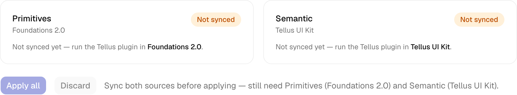
Tokens originate in Figma and flow into the portal through the Tellus Token Sync plugin. You don’t edit the JSON by hand — you change the variable in Figma, sync, review the diff, and apply.
- 1
Edit in Figma
Add or change the variable in the right file — primitives in Foundations 2.0, semantics in Tellus UI Kit. A new semantic must alias a primitive (never a raw value). - 2
Run the plugin → Sync
The plugin auto-detects which file is open and pushes that source to the portal. Run it once per file — primitives and semantics each. - 3
Review the diff in Admin
The portal stages the change and shows an added / changed / removed diff. Apply requires bothprimitives and semantics to be staged, so a semantic can never reference a primitive that isn’t there yet. - 4
Apply
Applying regenerates every platform file, refreshes the docs, and writes a changelog entry. New tokens appear on the docs automatically — there’s no hardcoded list to update.
Not an admin? Request the token from the design-system owners with the intent (what it’s for), and they’ll add it. Every applied change is visible on the Changelog.